


Aster

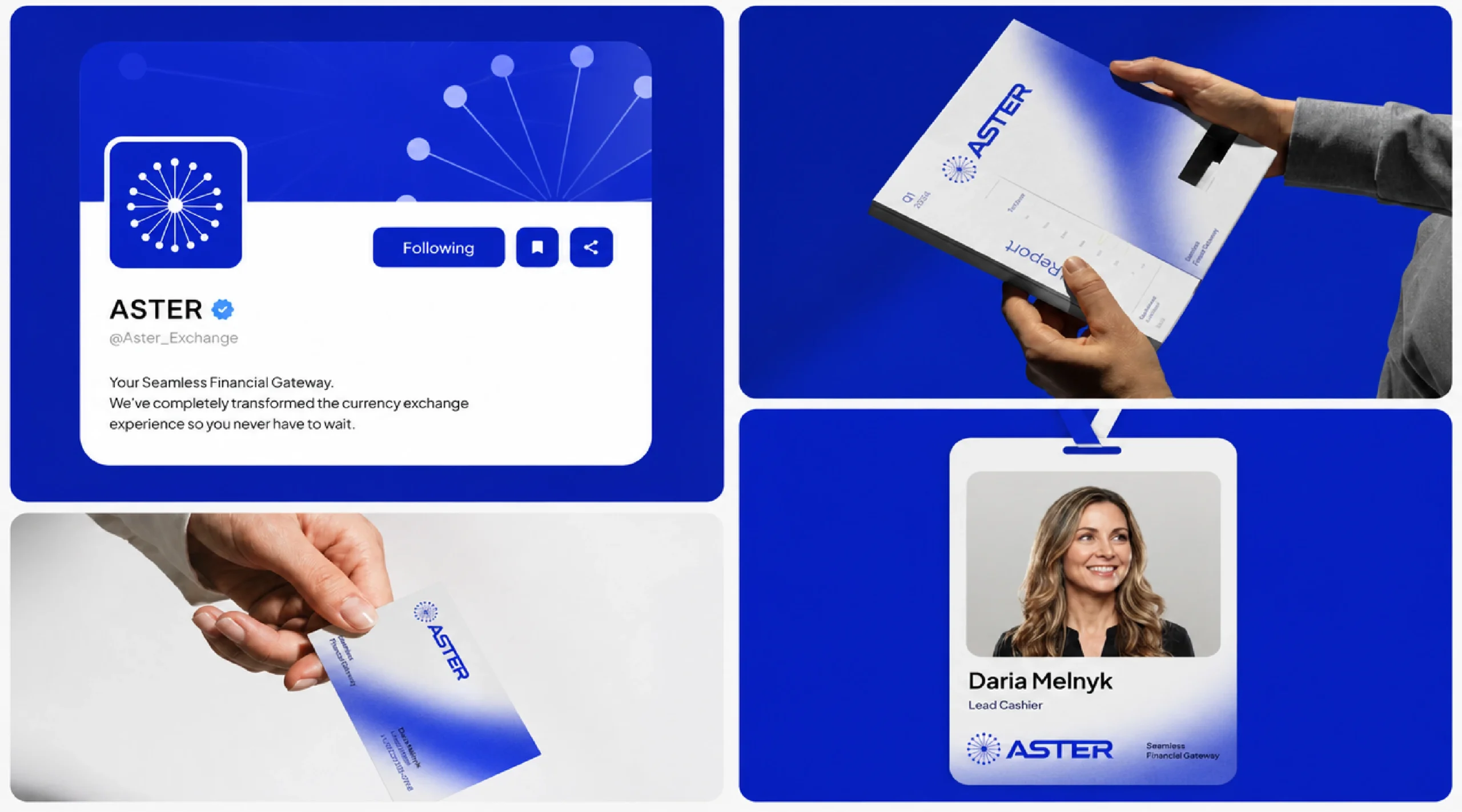
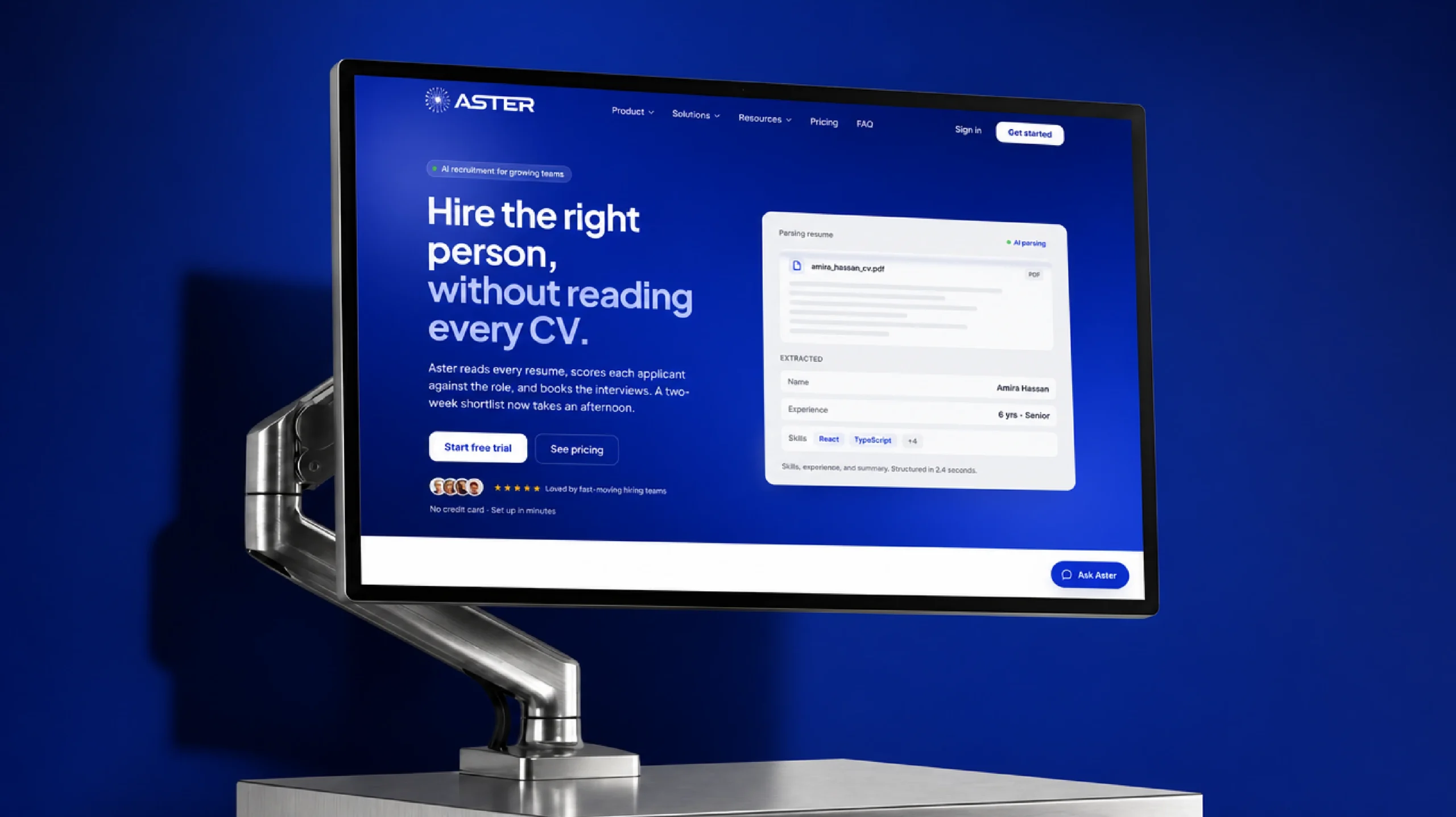
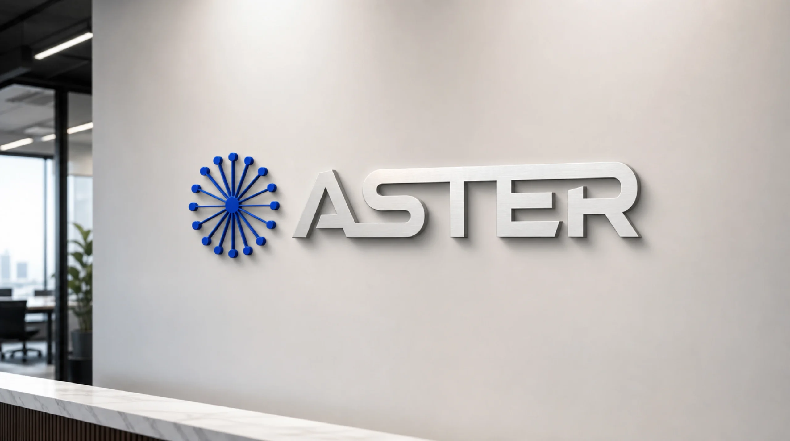
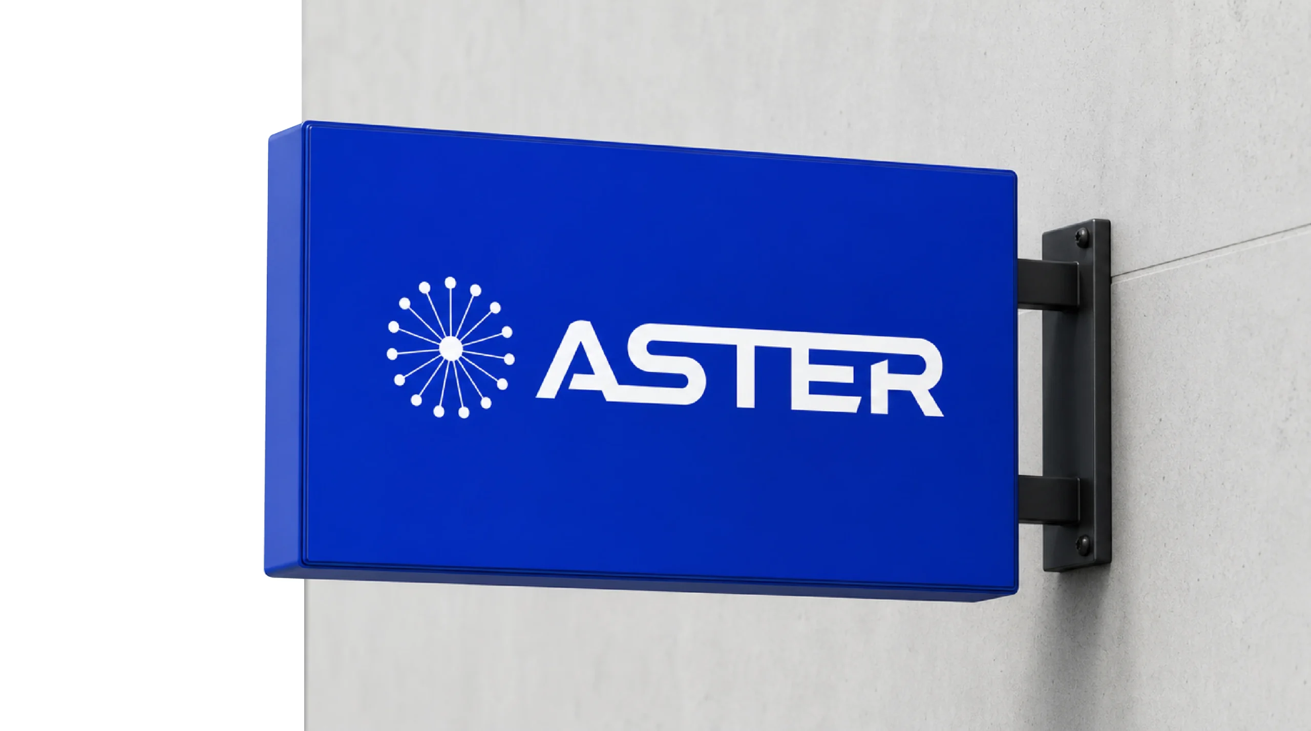
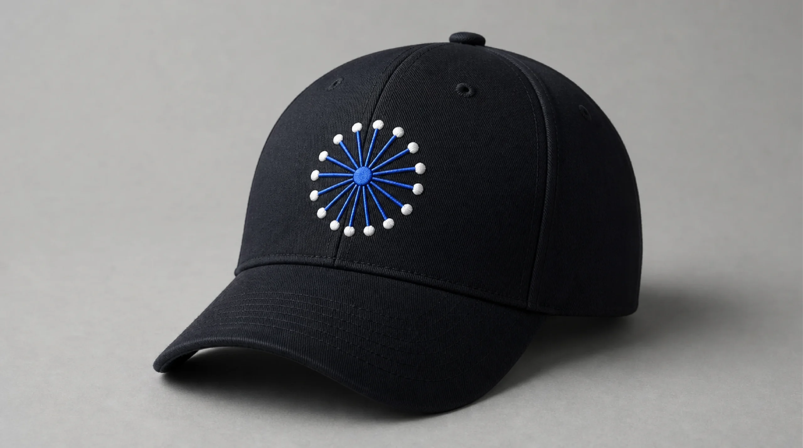
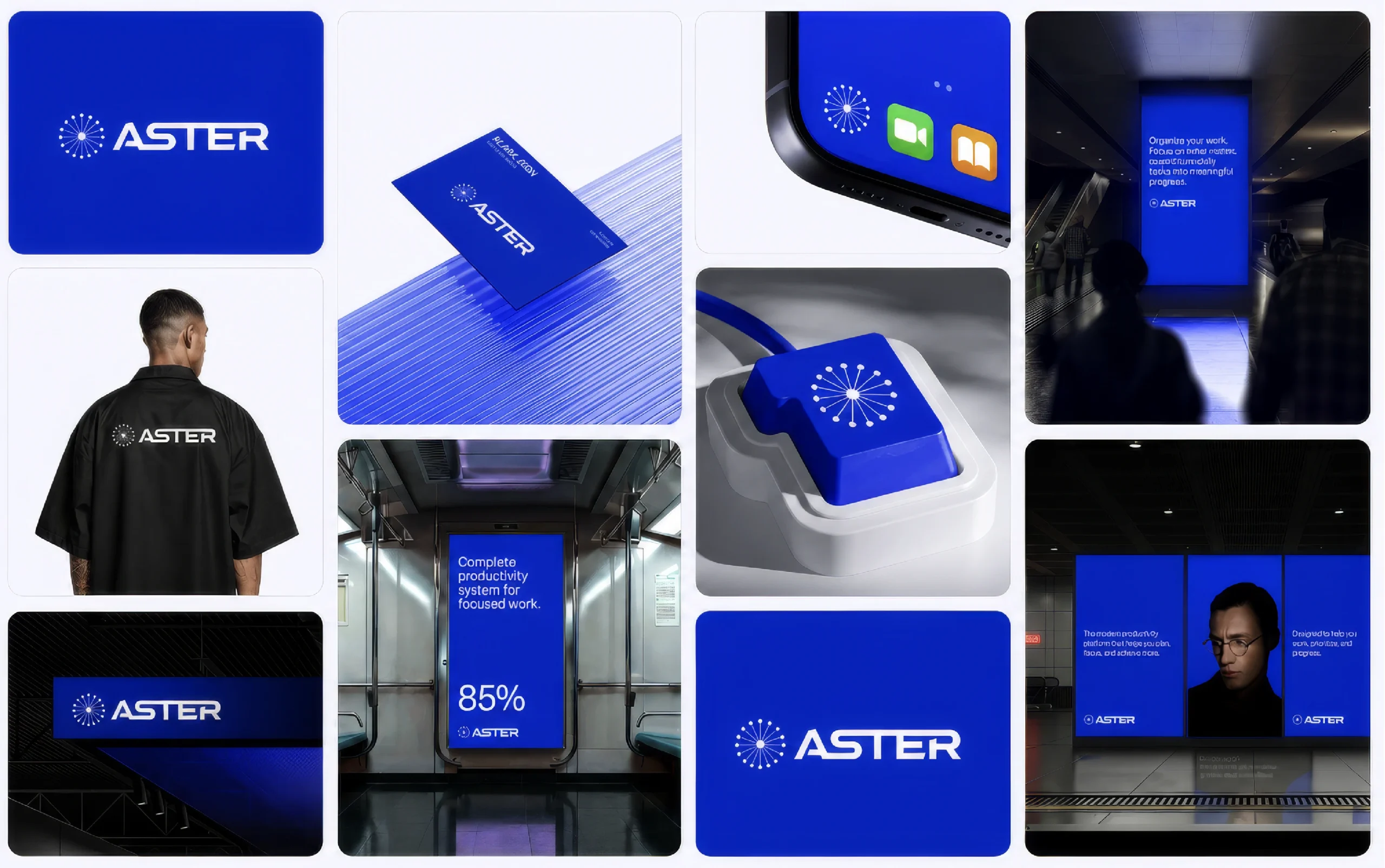
Brand identity for a productivity software company: a starburst mark, one saturated blue and a system that works from a 16px app icon to a full-size billboard.

Client

Aster

Industry

Tech / SaaS

Services

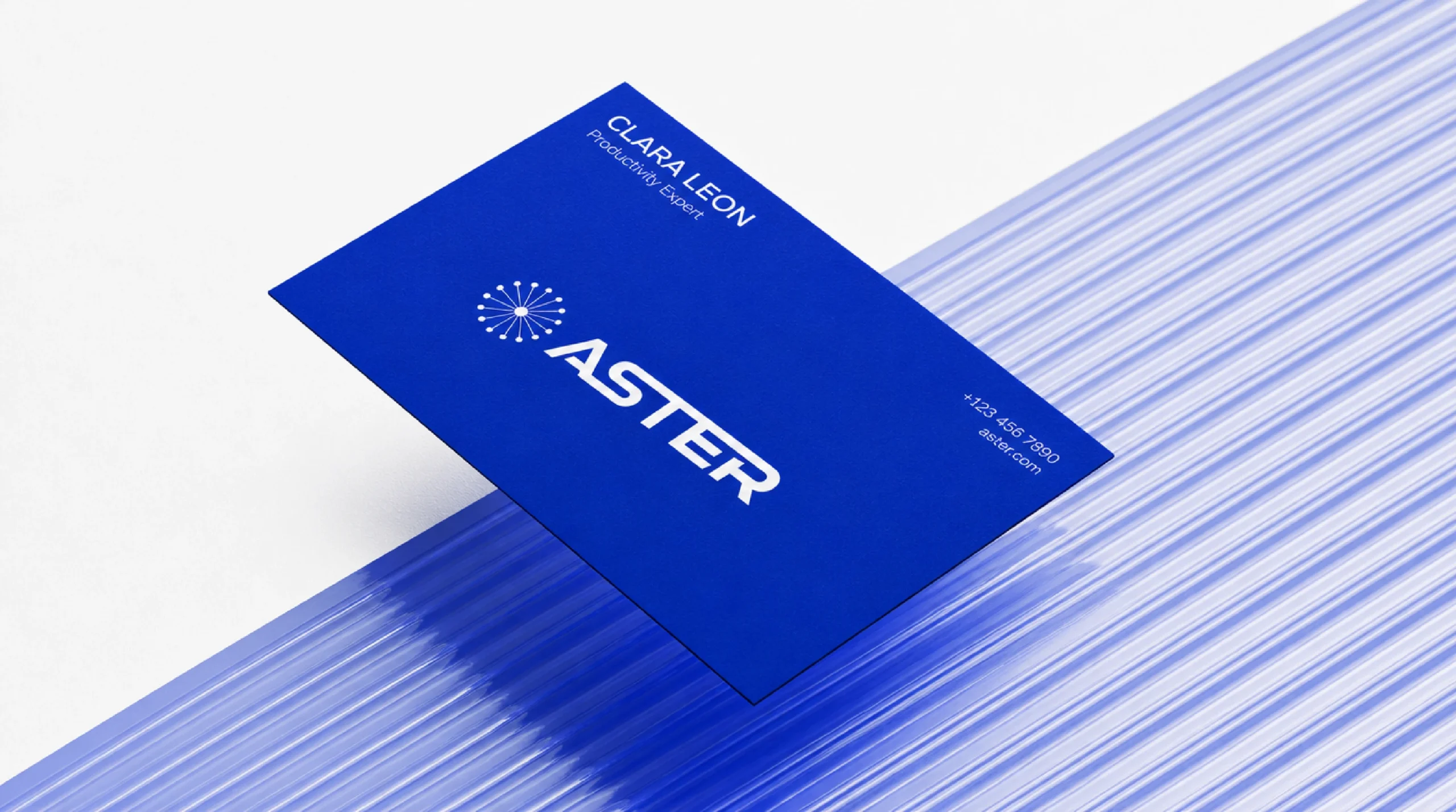
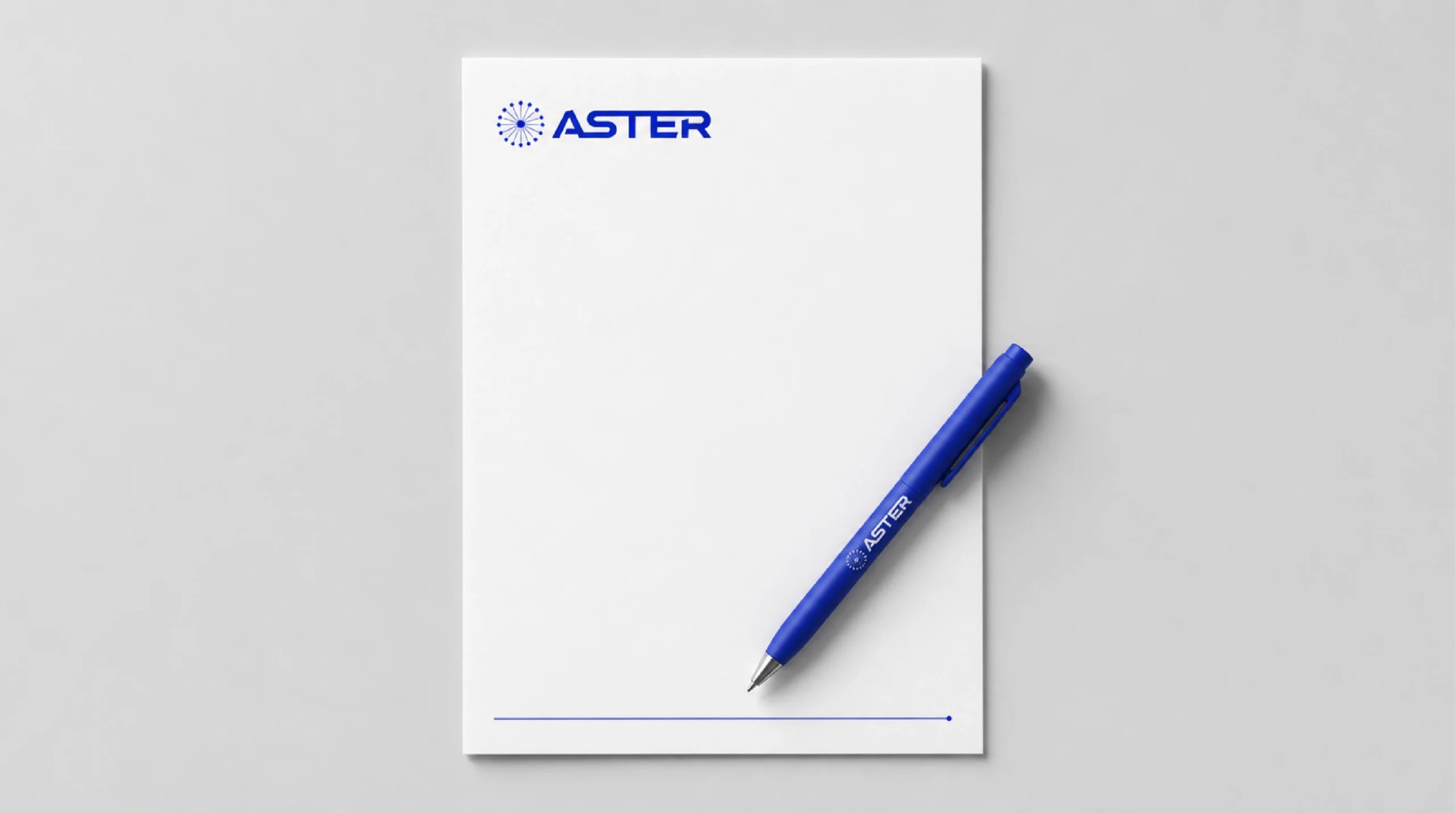
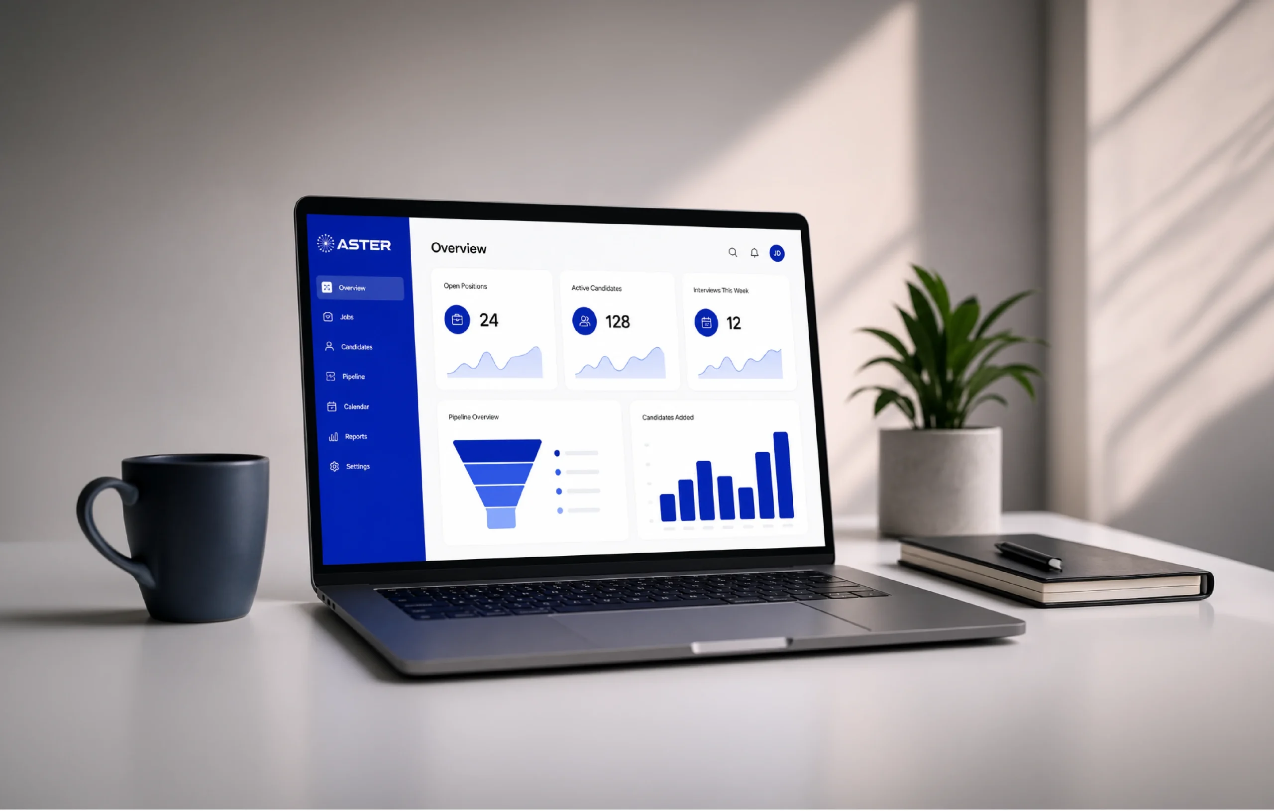
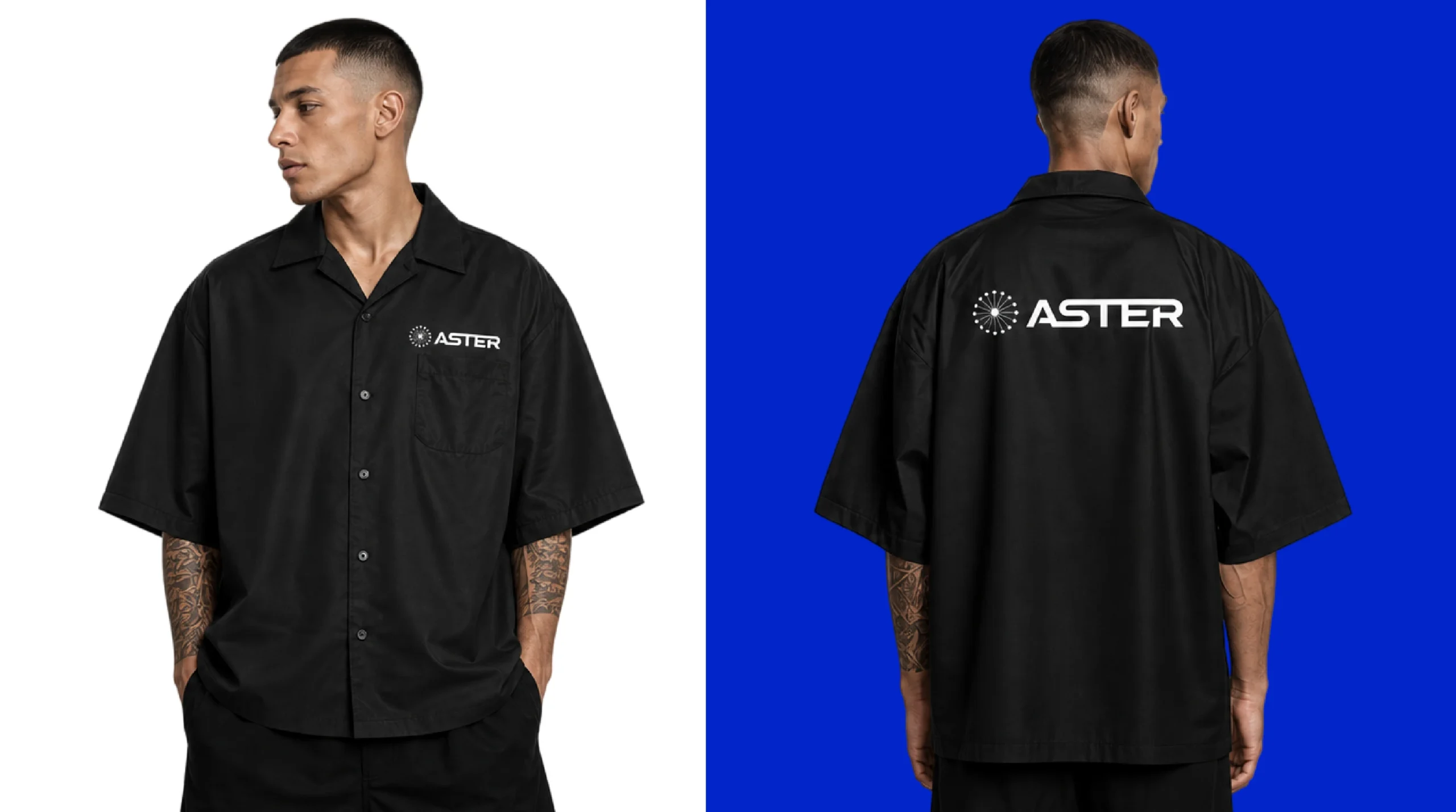
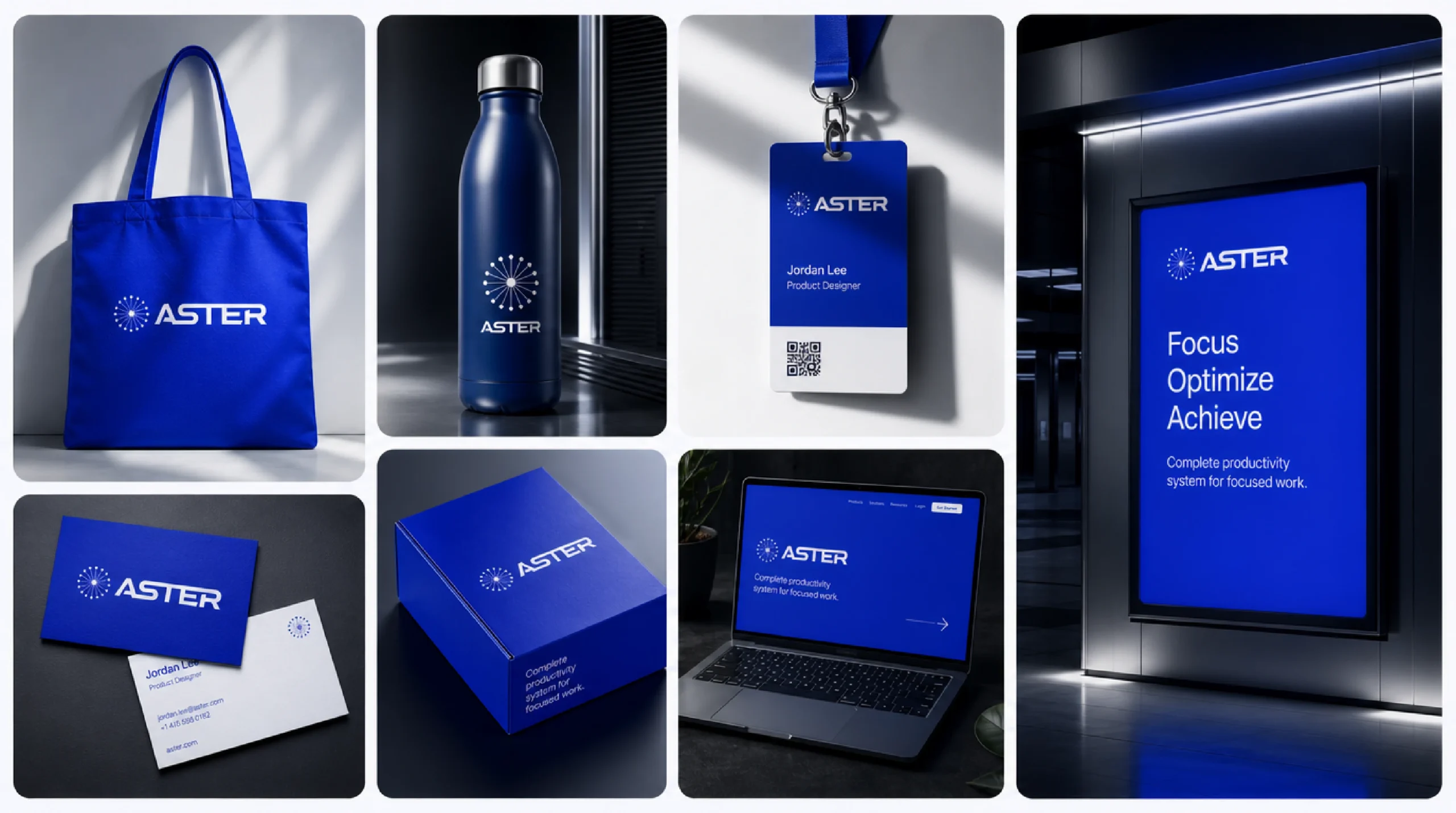
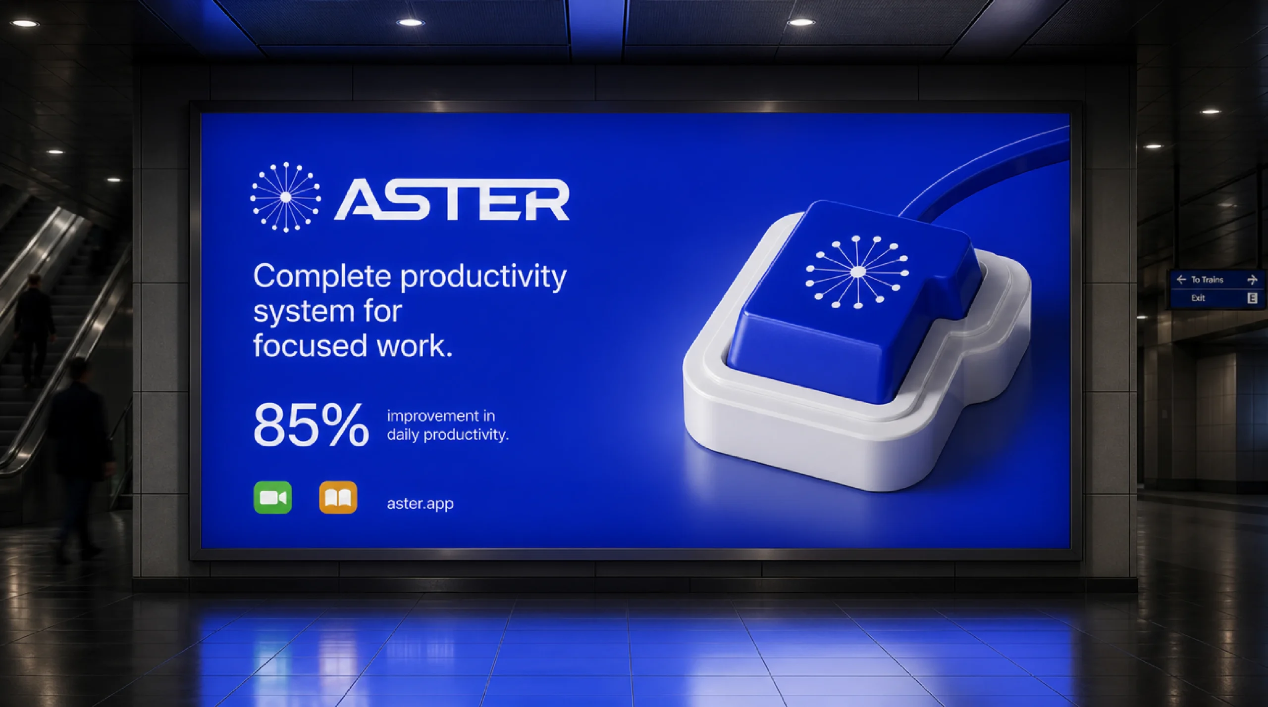
Logo, brand identity, app icon, product UI, stationery, signage, merchandise, campaign

( The brief )

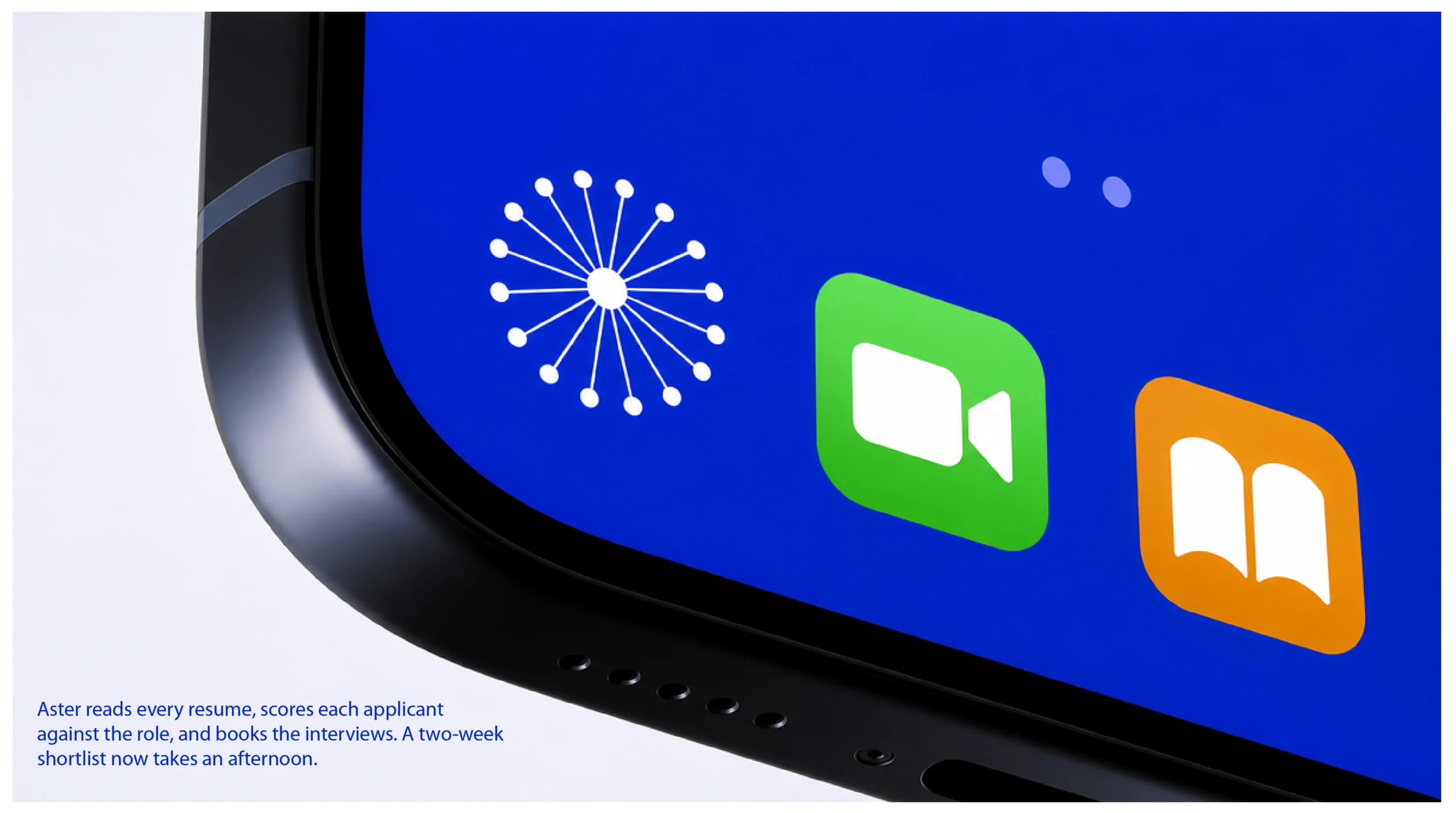
Small enough for an app icon.

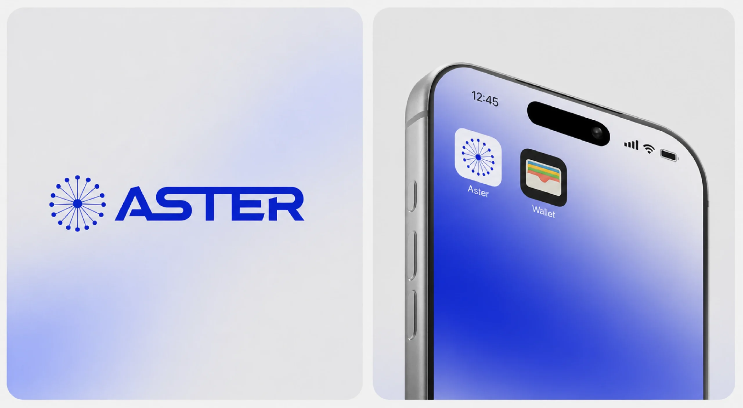
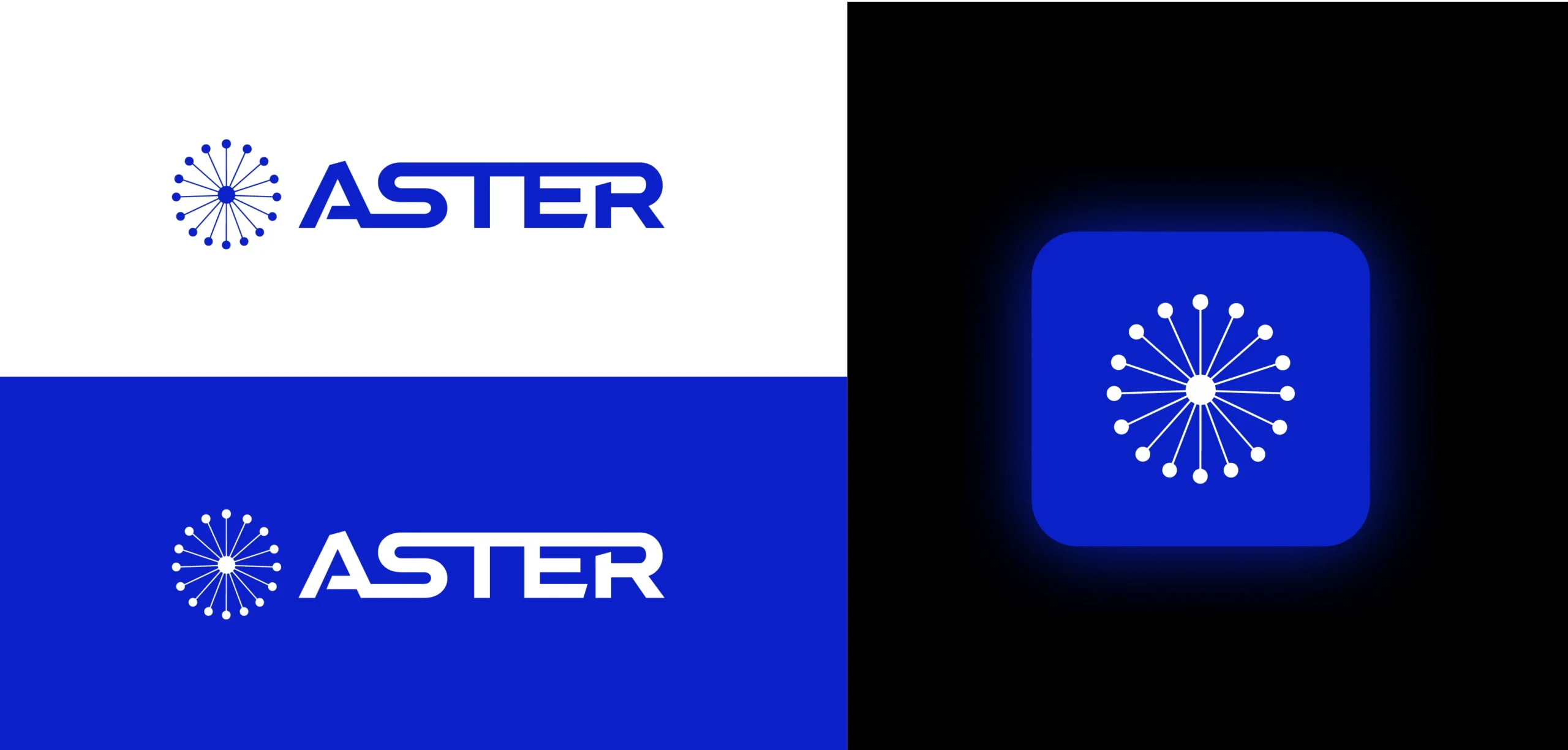
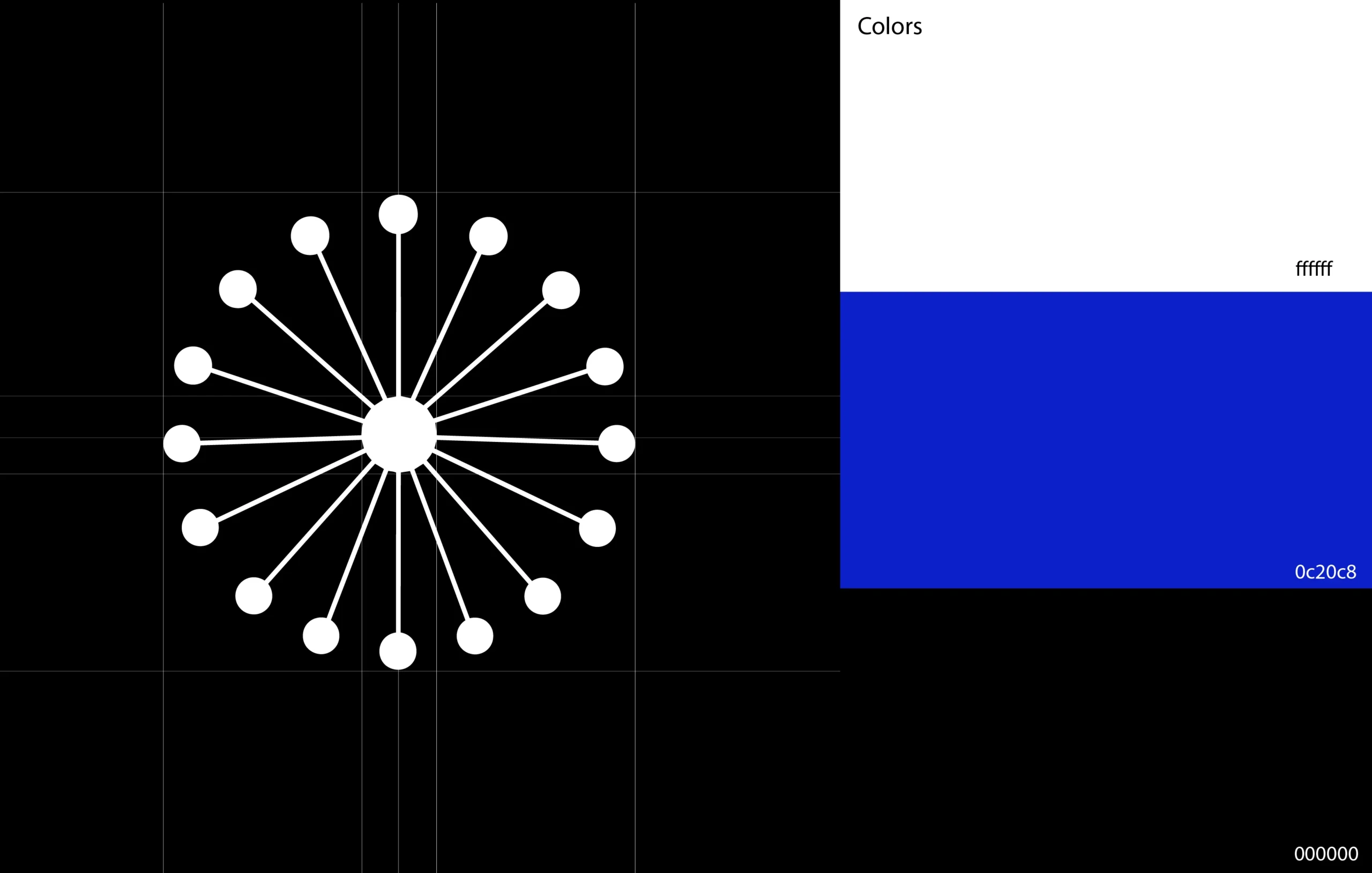
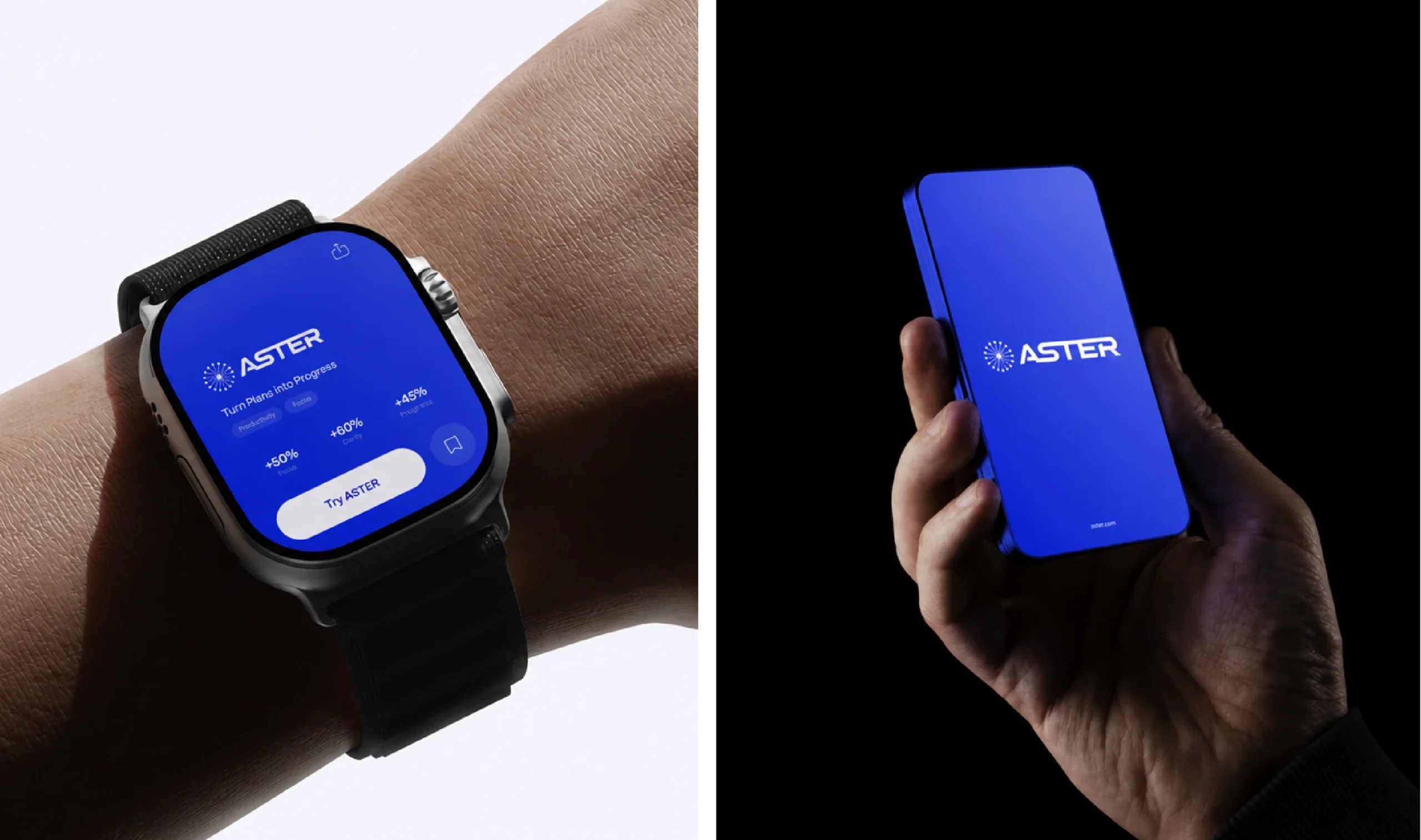
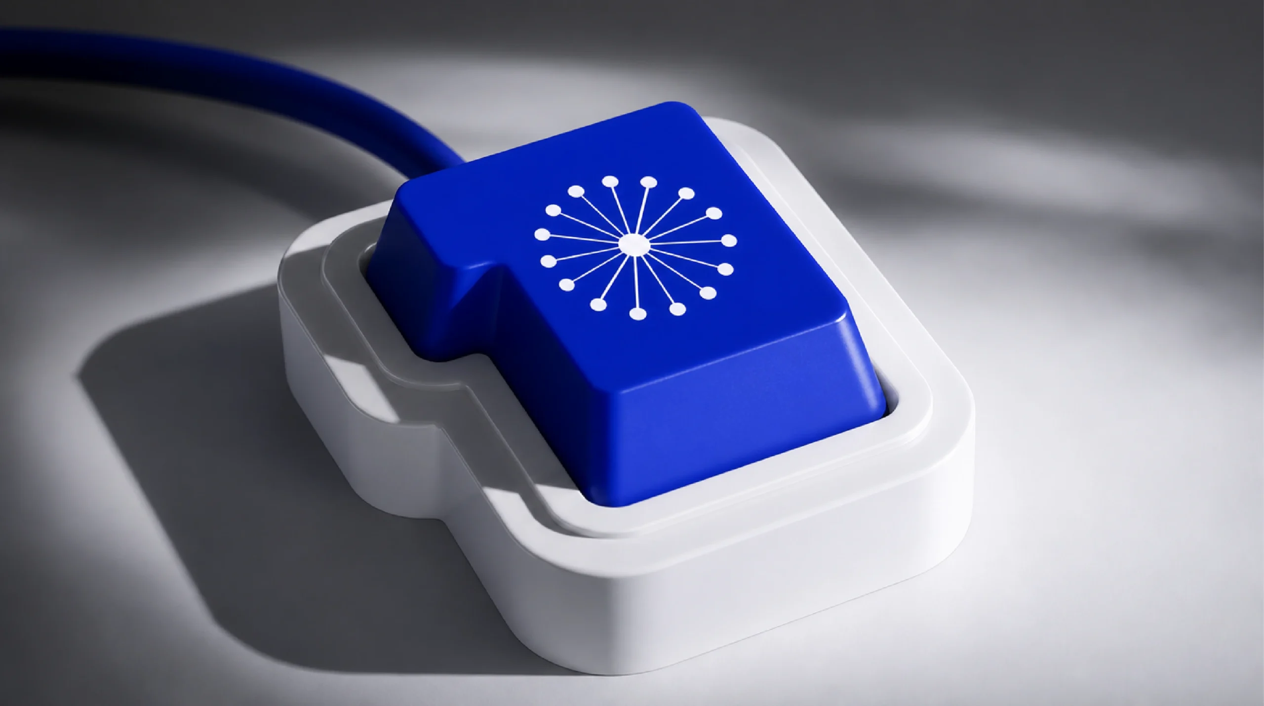
Aster needed a mark that reads at app-icon size and still holds a wall. We drew a starburst of evenly spaced rays around one point, paired it with a wide geometric wordmark and built the whole system on a single electric blue with black and white, so every screen, print and product feels like the same brand.

Aster blue #0C20C8White #FFFFFFBlack #000000

Placeholder image — replace

( Next step )

Your brand could be next.

Tell us what you’re building and what isn’t working yet. We reply within one business day.