

Aster
Aster
Brand identity for a productivity software company: a starburst mark, one saturated blue and a system that works from a 16px app icon to a full-size billboard.
Client
Aster
Industry
Tech / SaaS
Services
Logo, brand identity, app icon, product UI, stationery, signage, merchandise, campaign
01
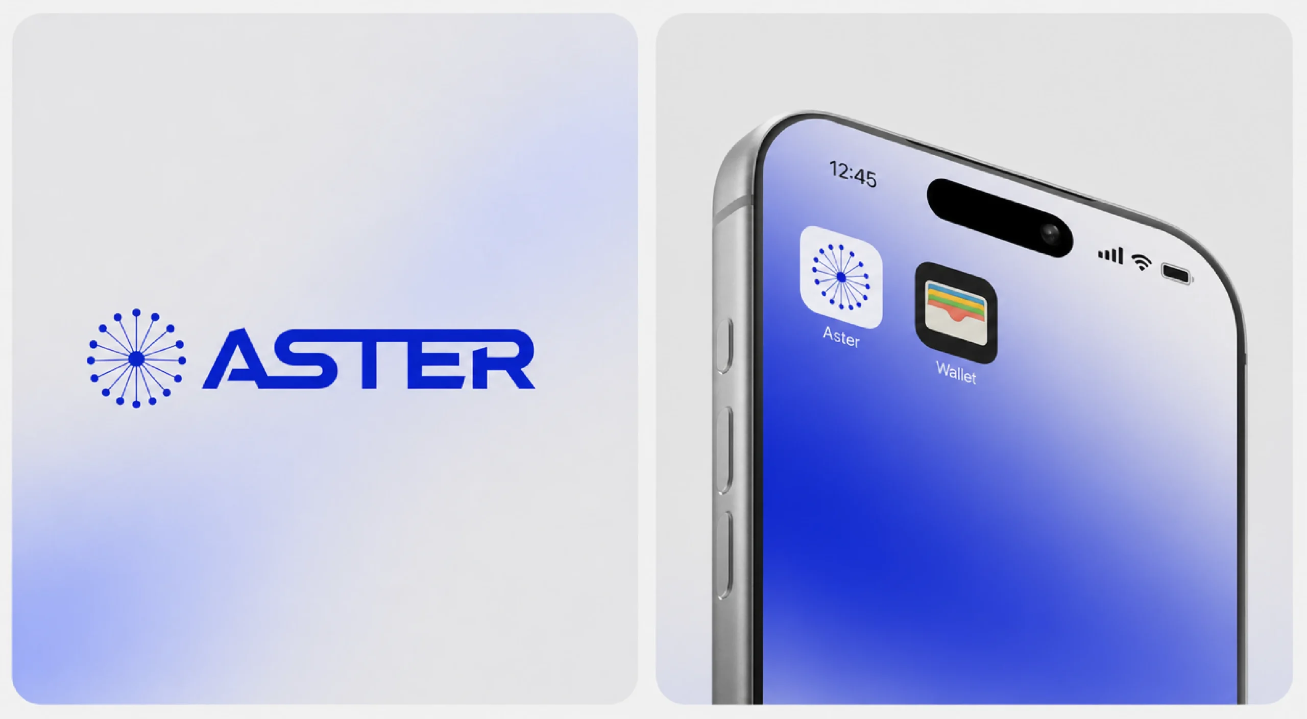
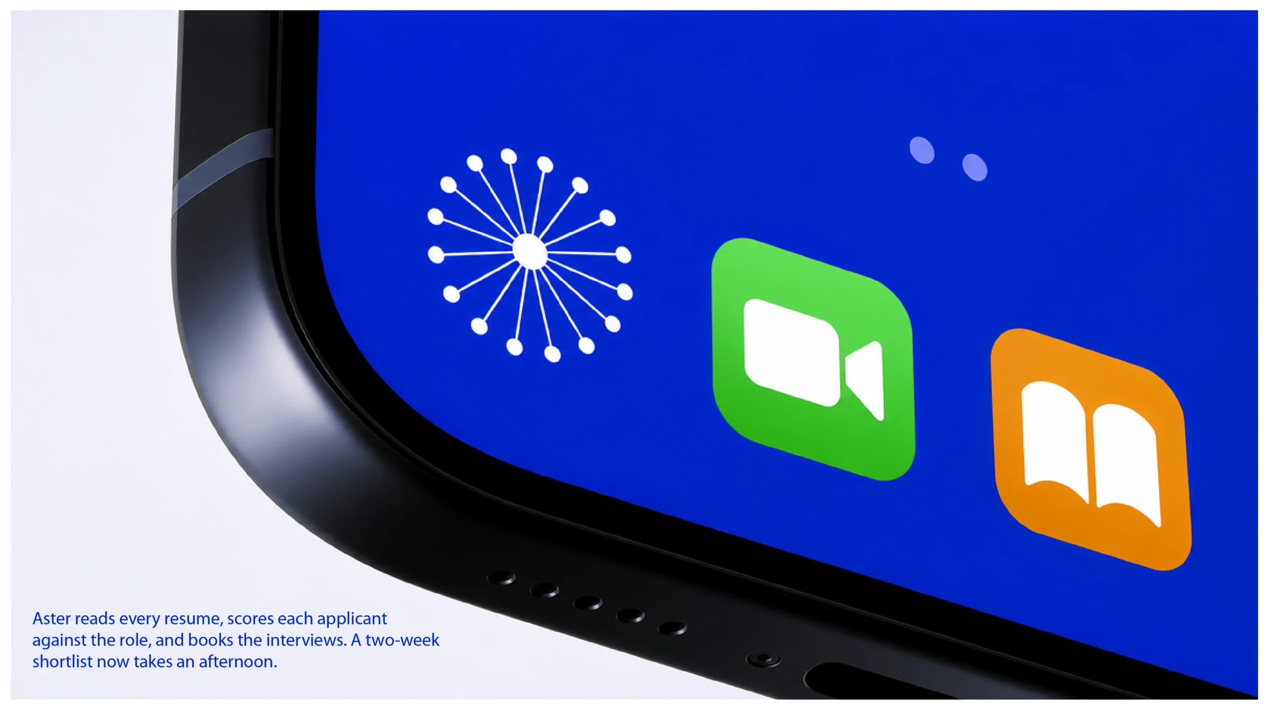
Logo
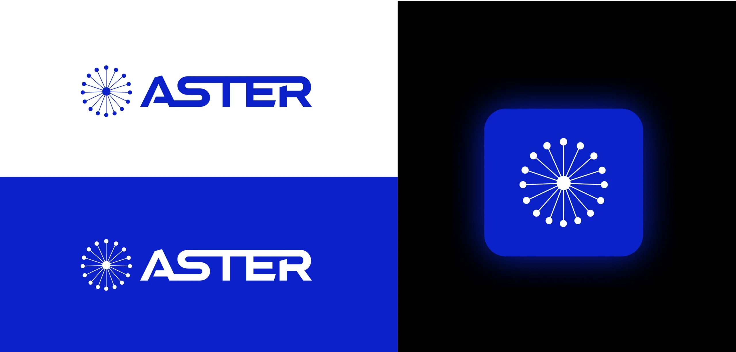
The starburst mark and wordmark, with the icon on the home screen.
02
Lockups & icon
Primary lockups on white and blue, and the app icon on black.
03
Construction & colour
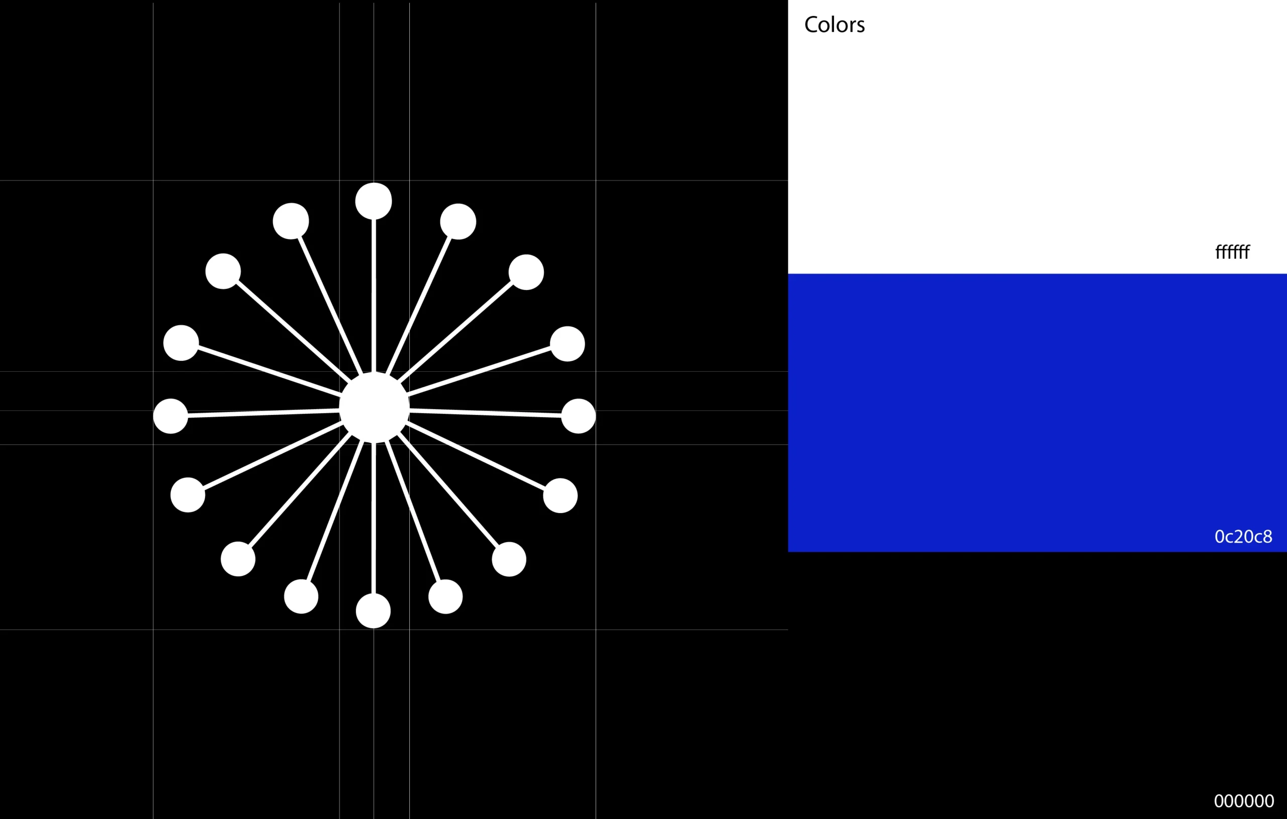
Rays set on a strict radial grid; one blue, black and white carry the whole system.
04
App icon
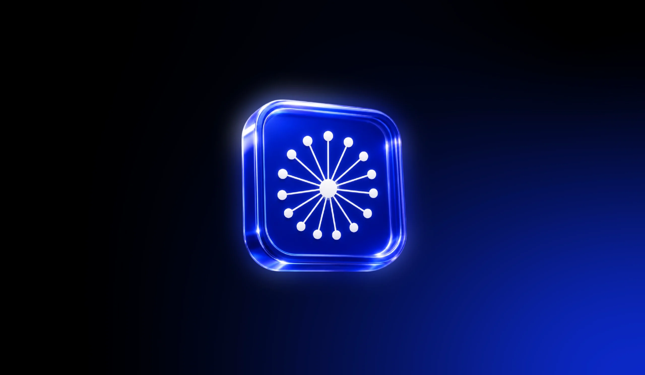
The icon rendered as a glass object for launch visuals.
05
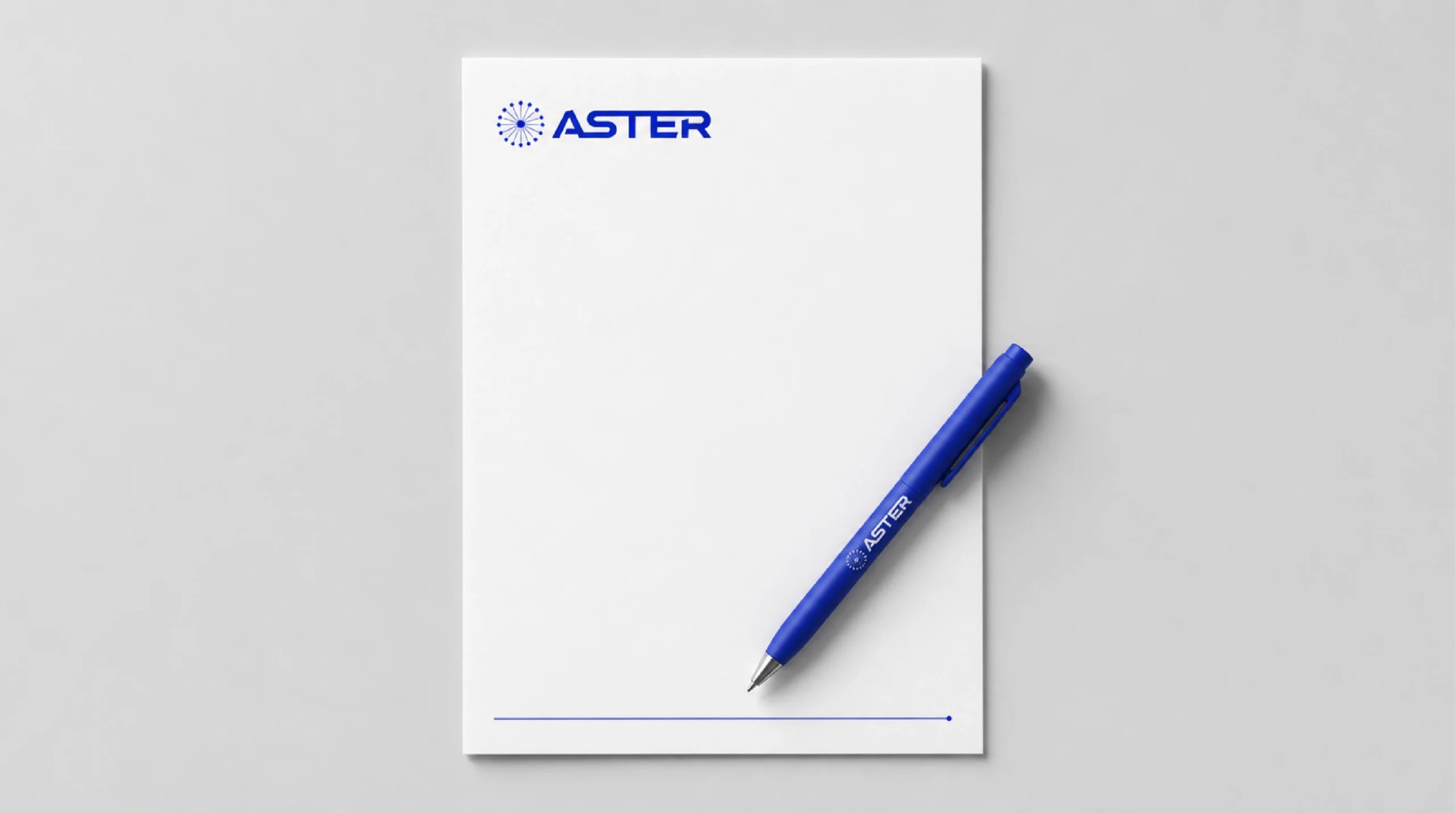
Stationery
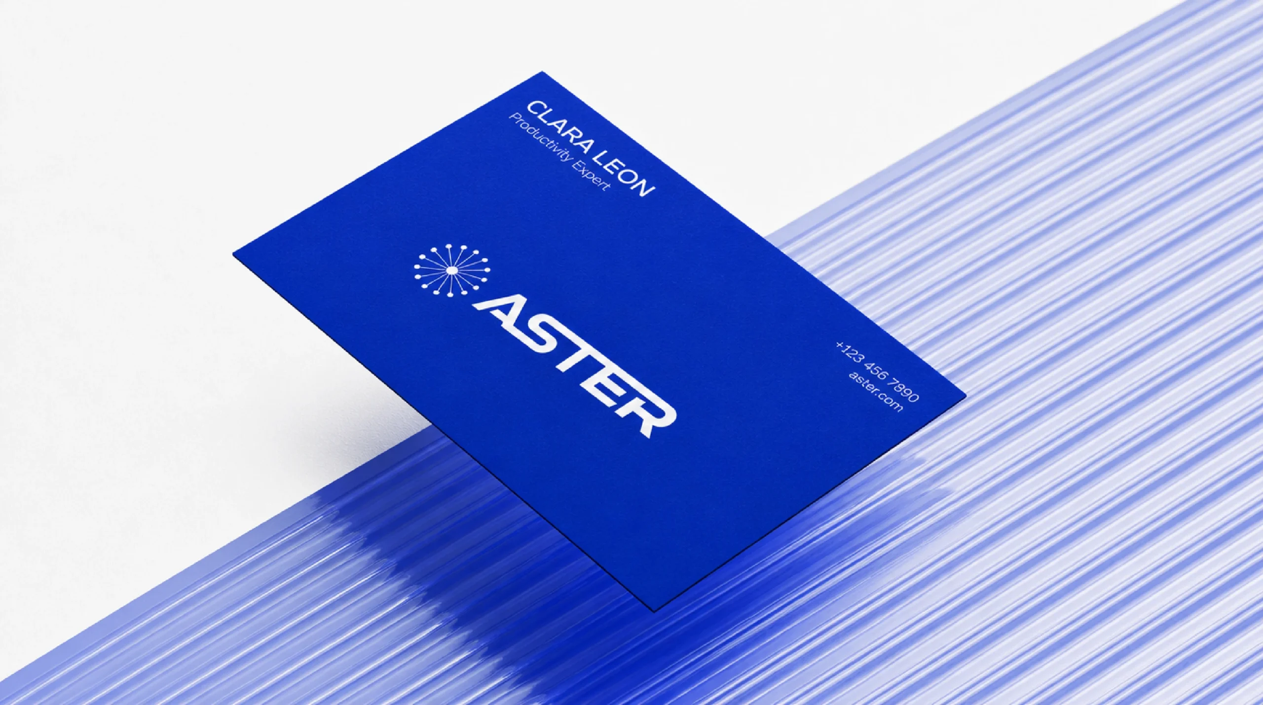
Business cards and letterhead in the signature blue.
06
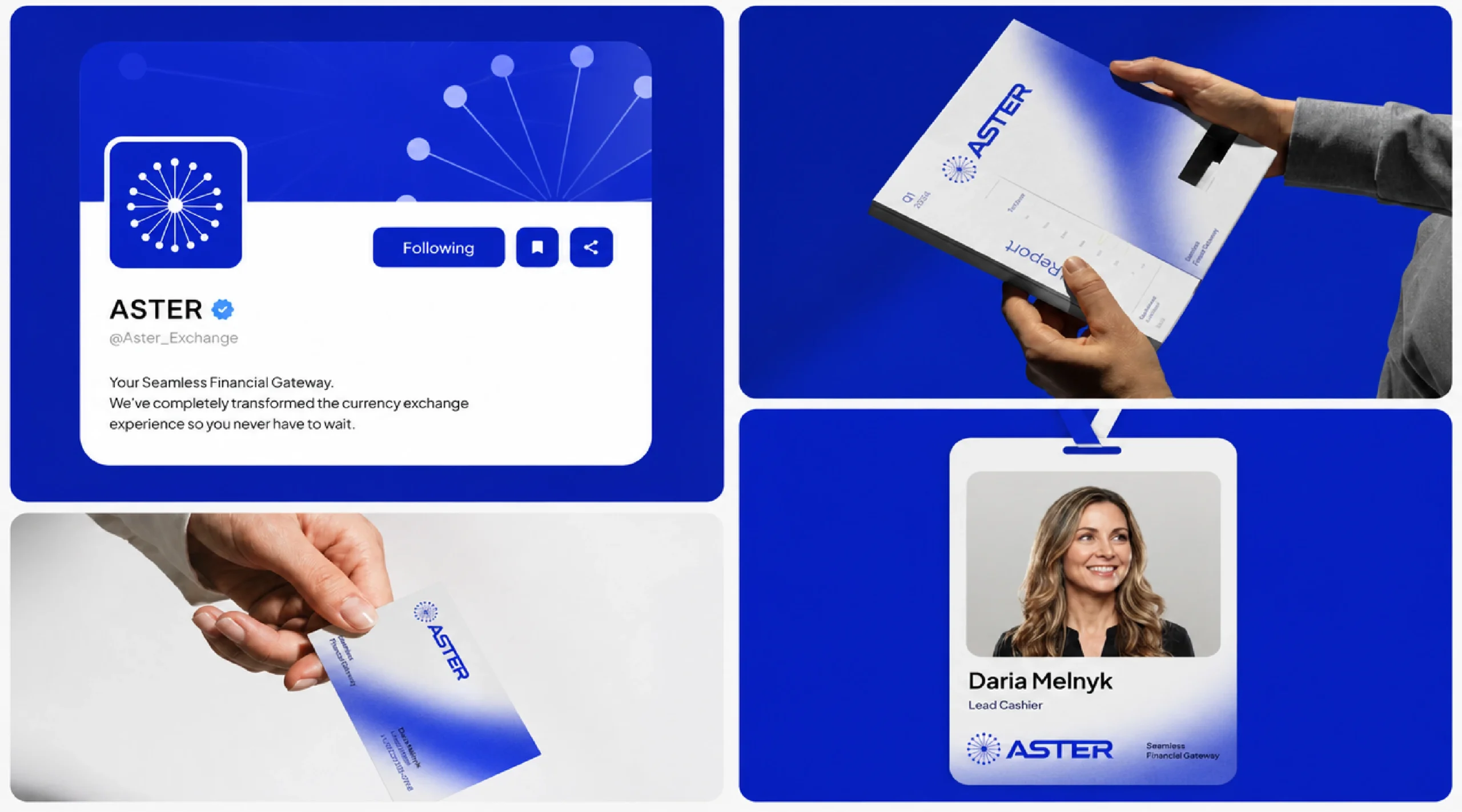
Brand in use
Social profile, team ID and printed material speaking with one voice.
07
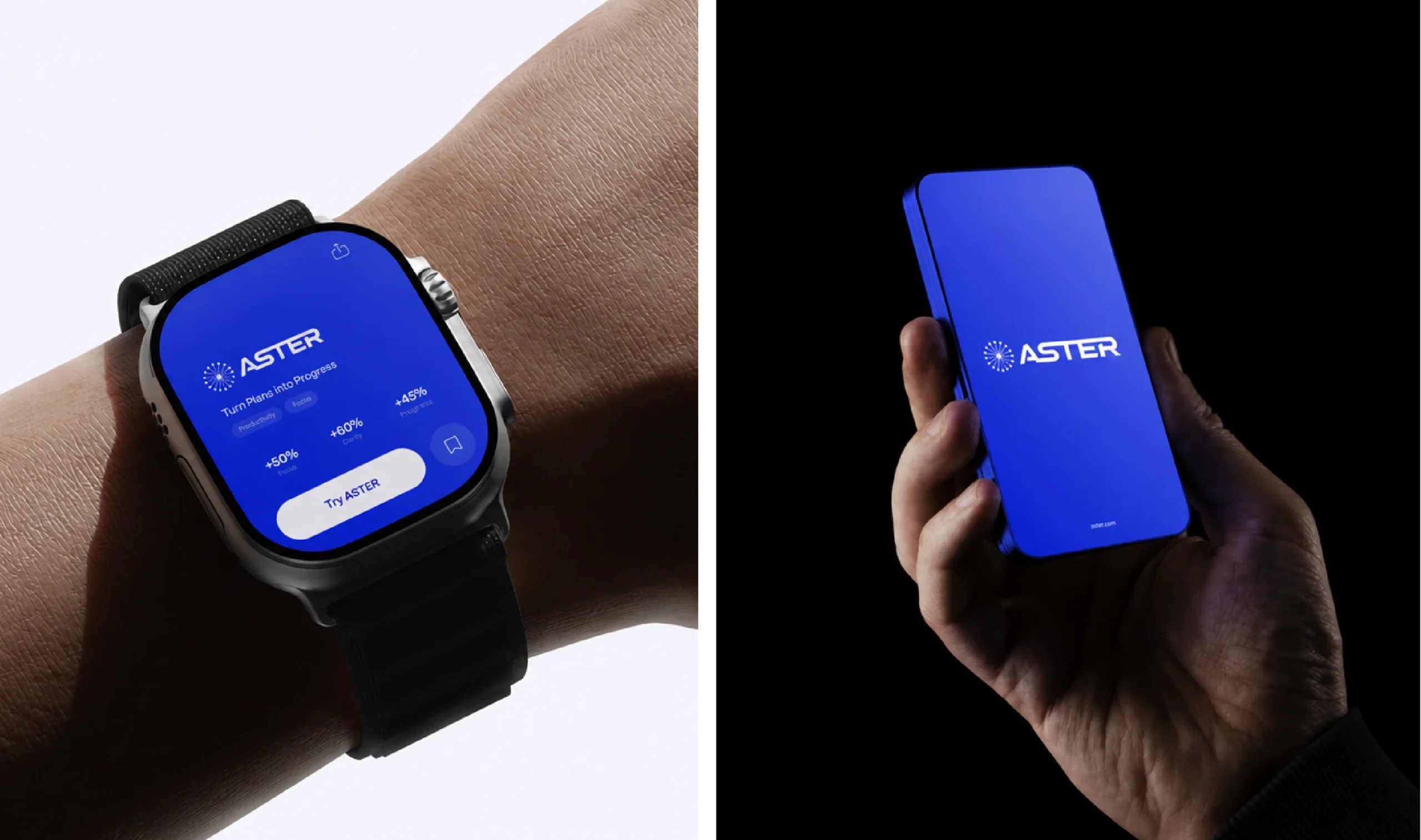
Mobile
The icon on the phone, and the product on wrist and hand.
08
Product & web
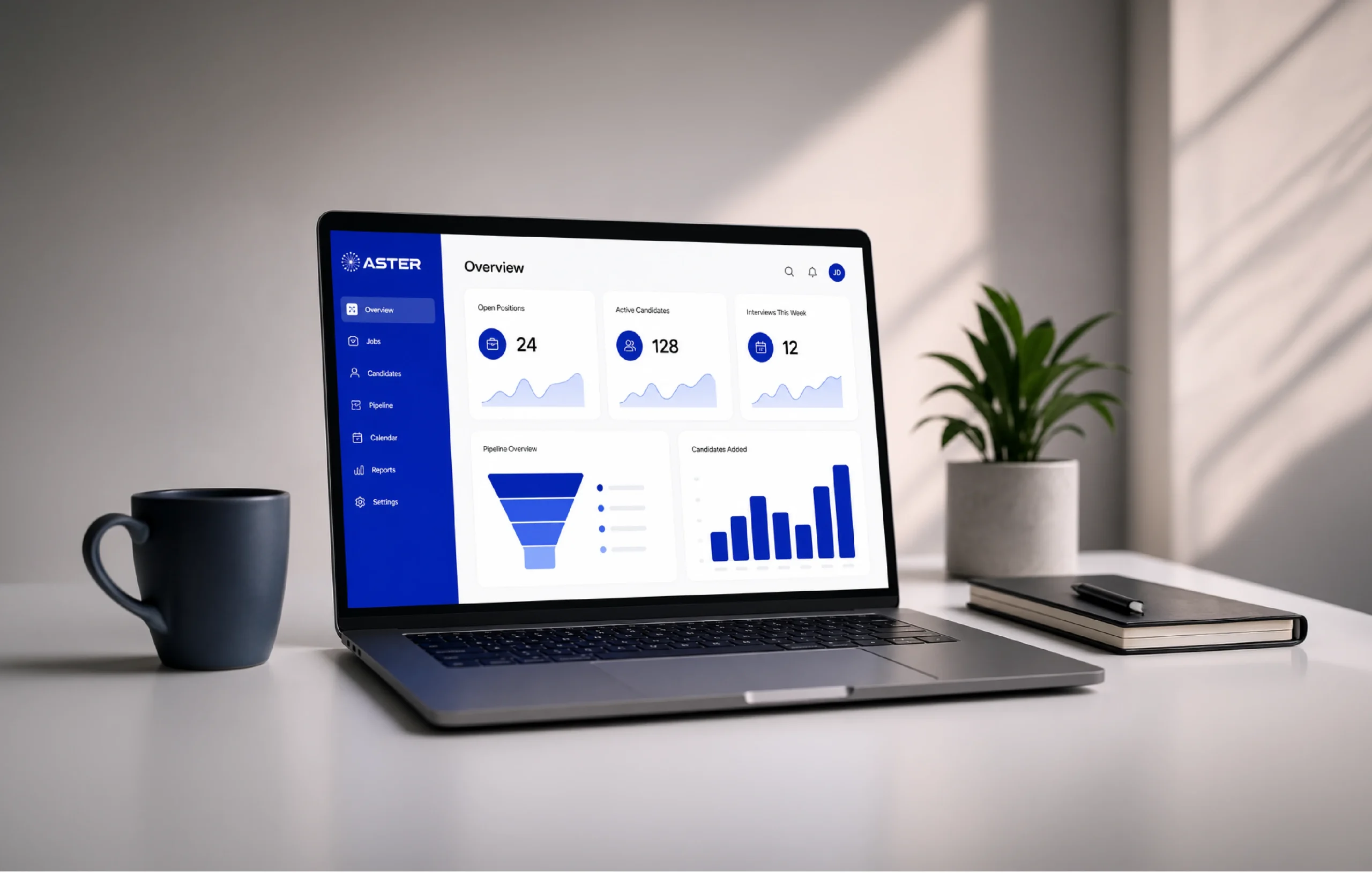
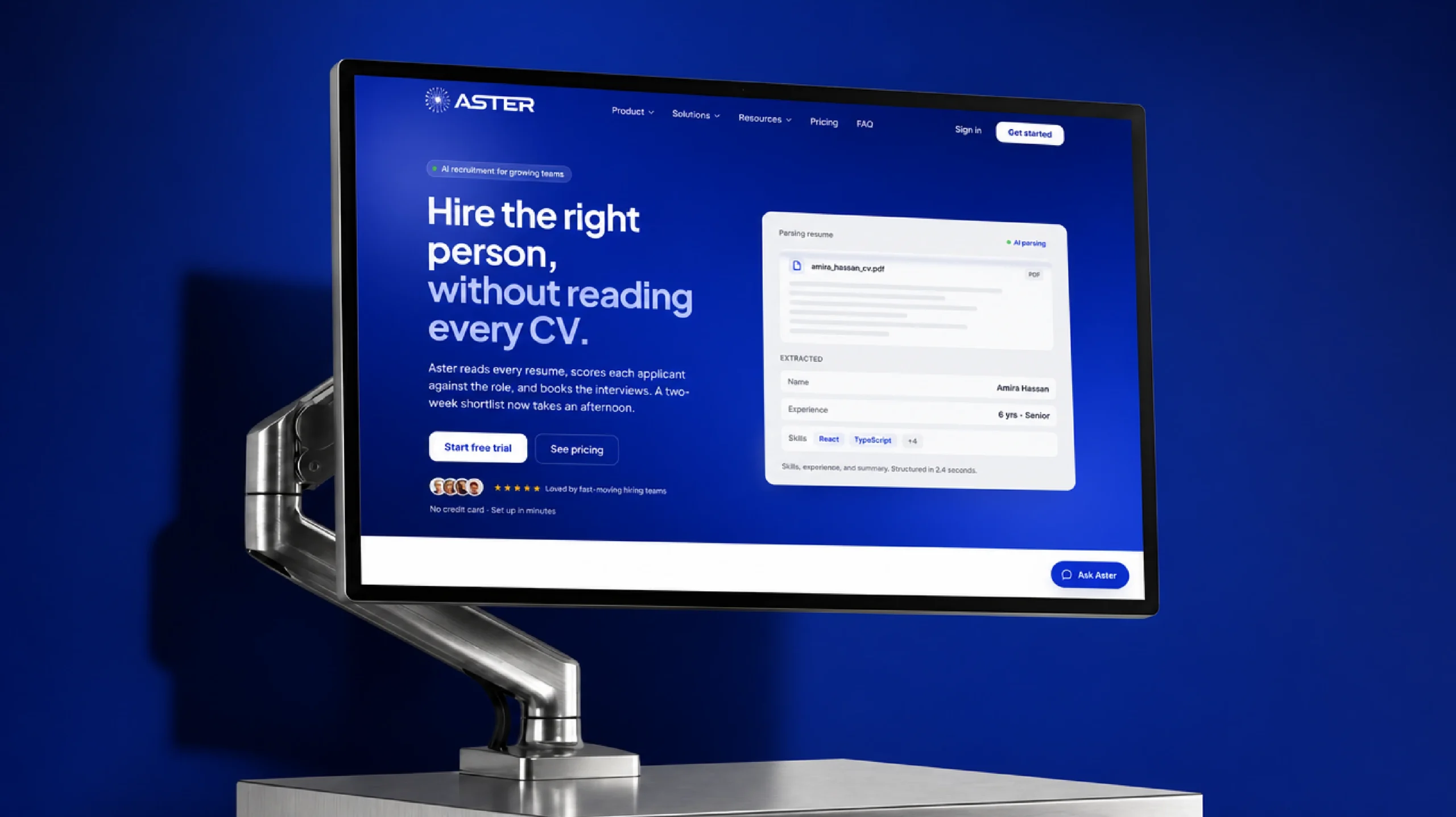
Dashboard and marketing site built on the same grid and blue.
09
Signage
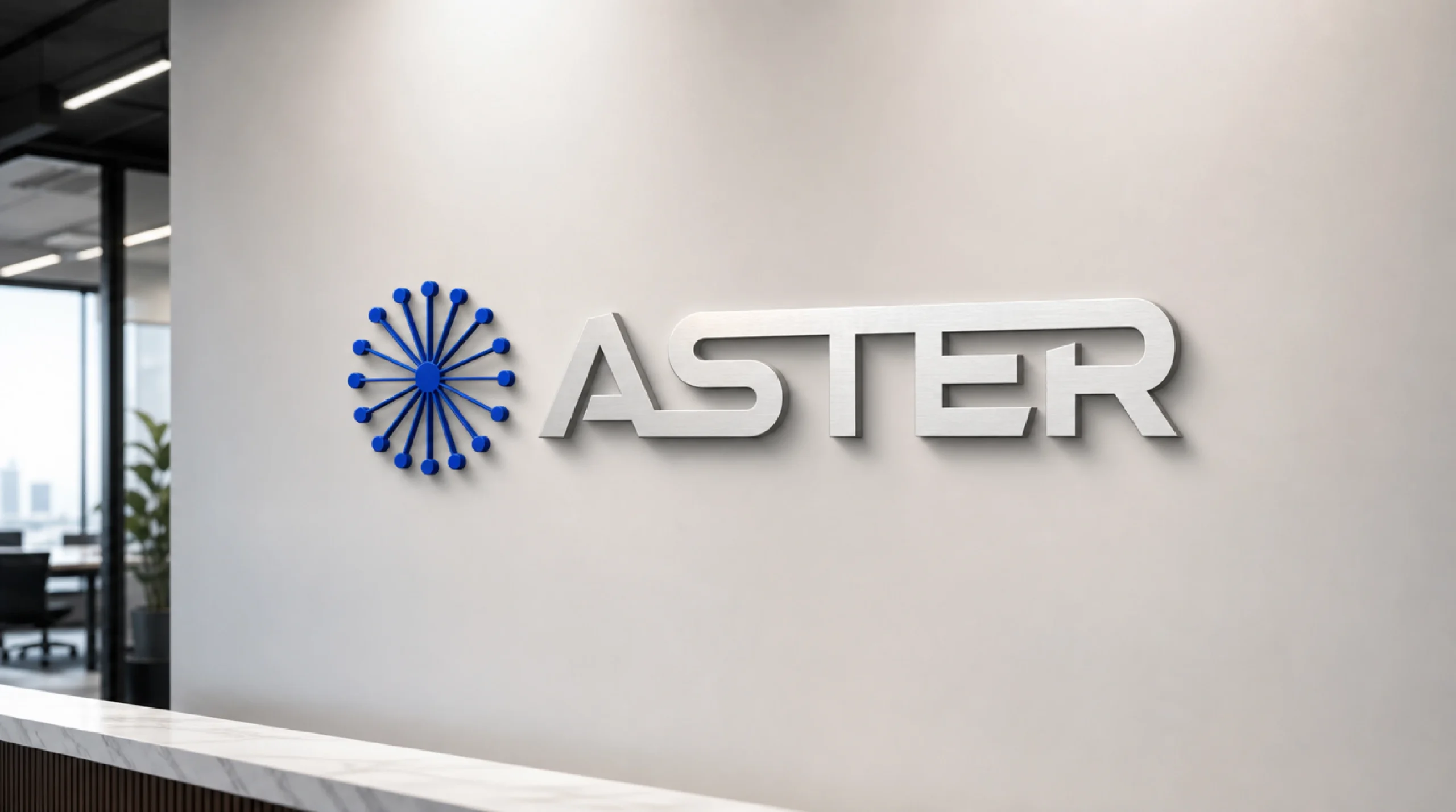
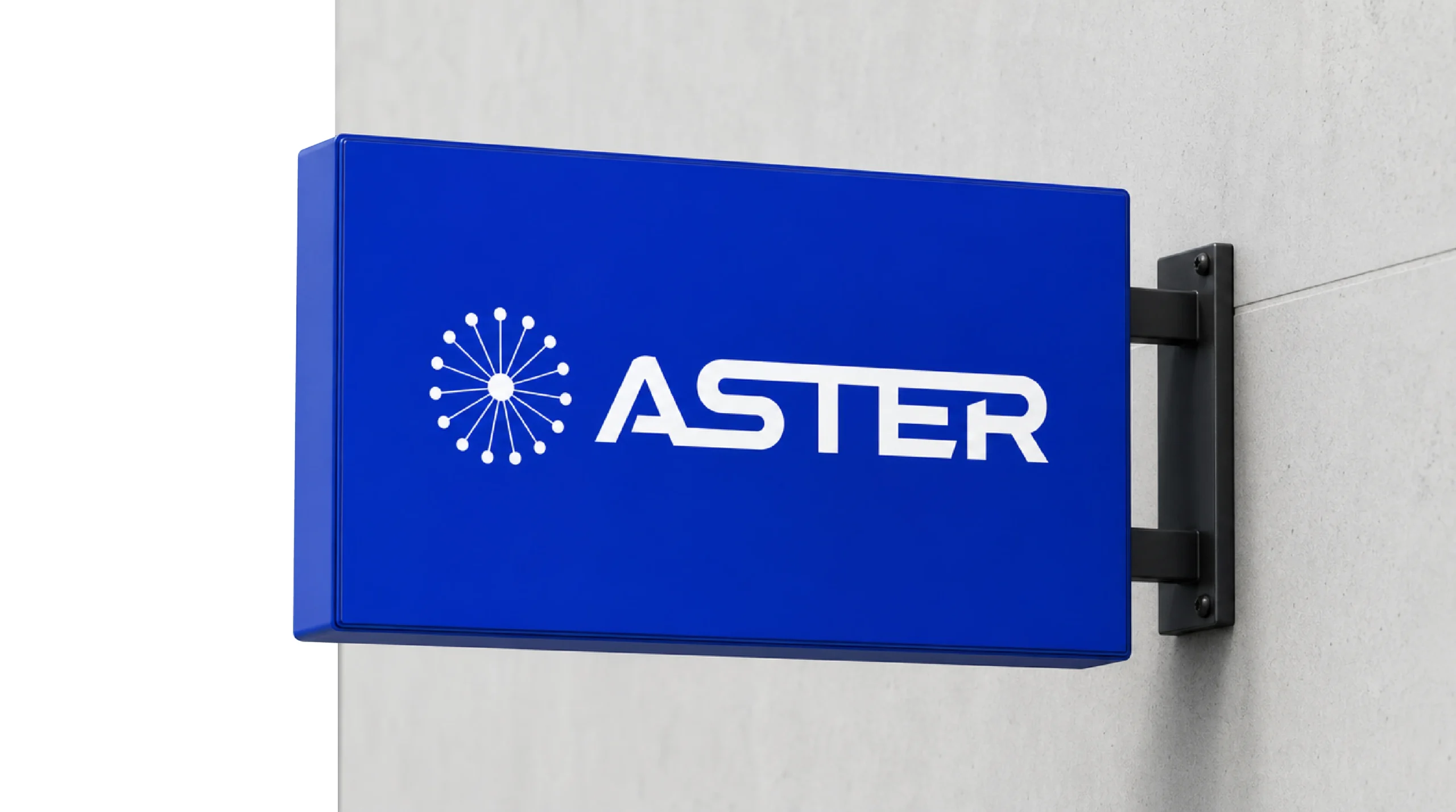
A dimensional wall logo for the office and a projecting sign outside.
10
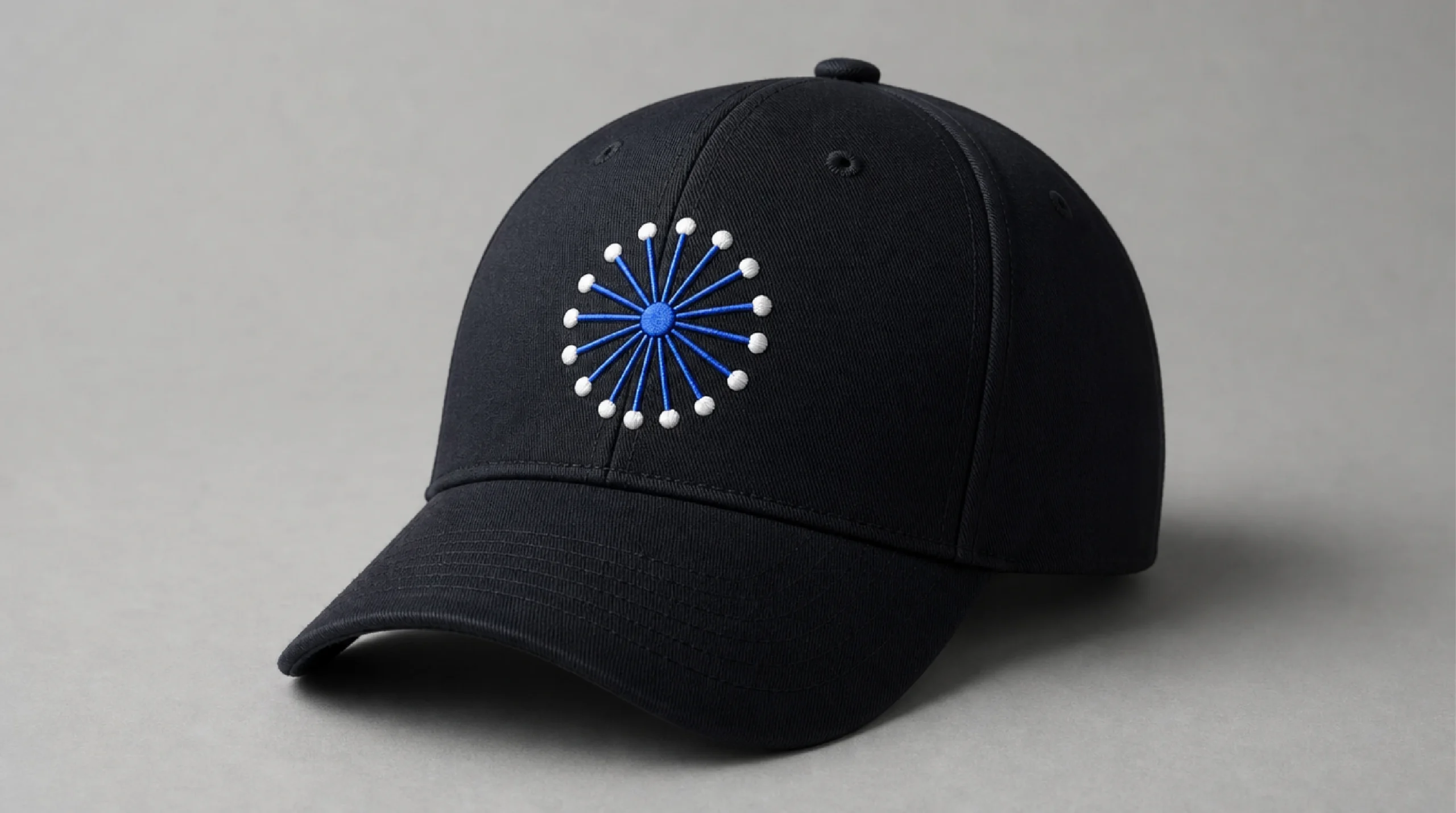
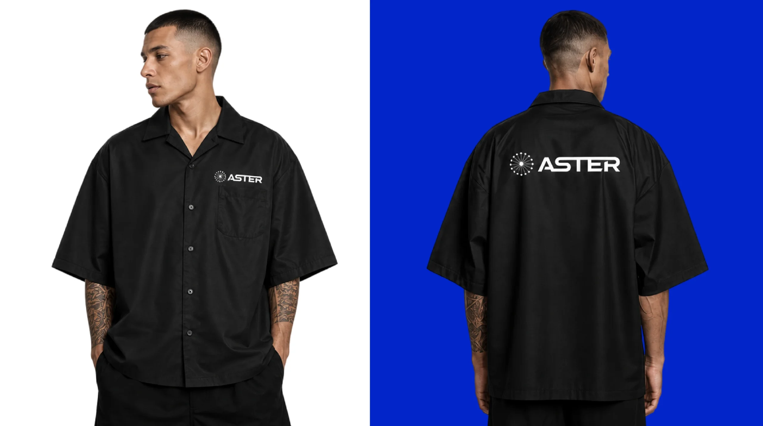
Merchandise
Embroidered caps and team shirts.
11
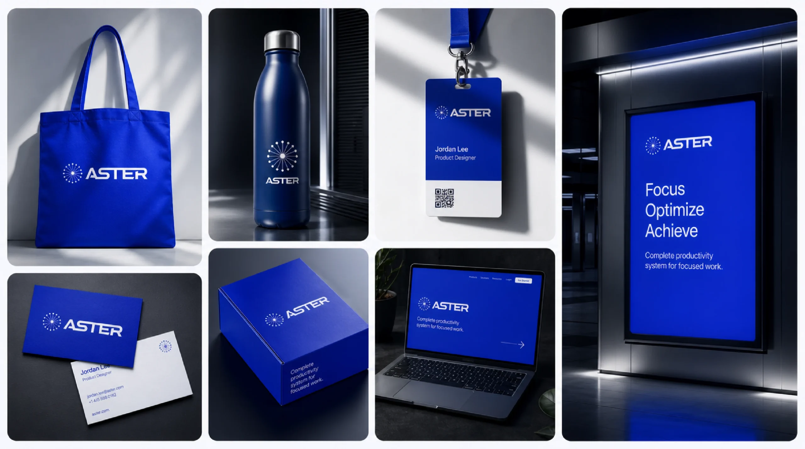
Brand kit
Tote, bottle, lanyard, packaging and print from one kit.
12
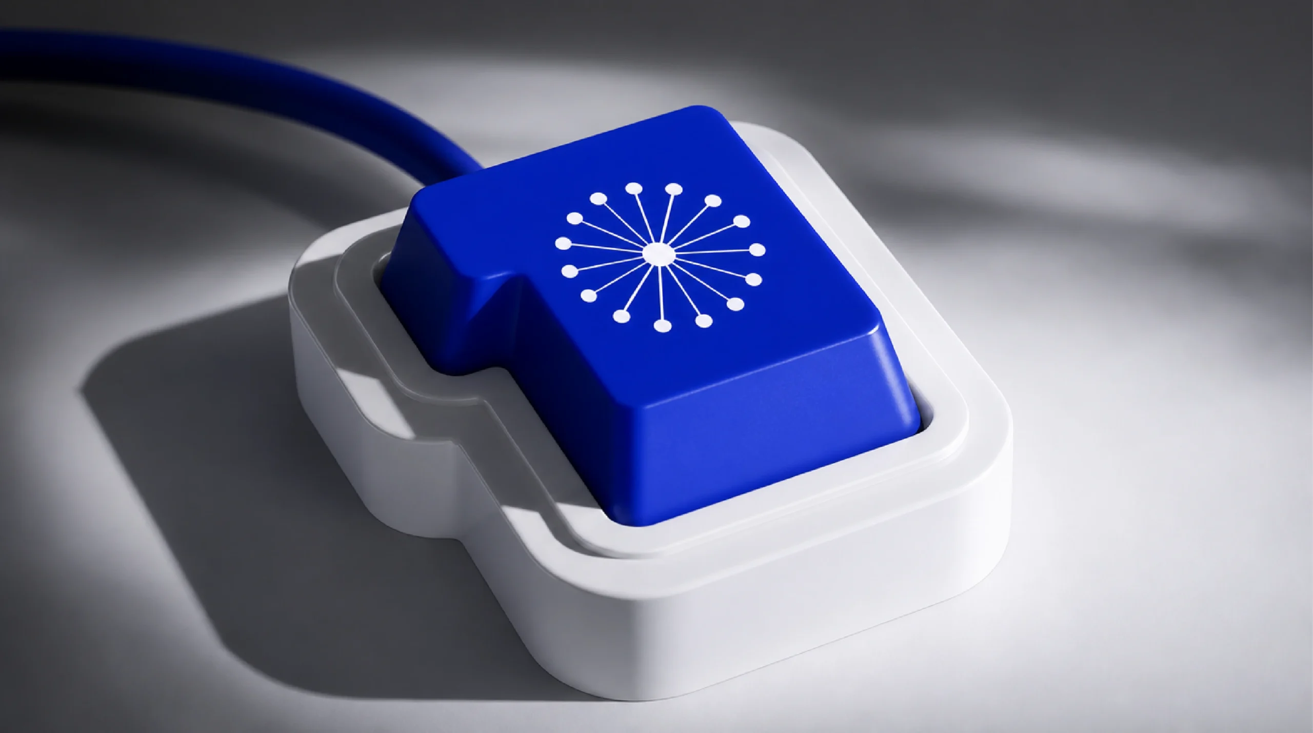
The mark as an object
A desk keycap that turns the starburst into something to press.
13
Campaign
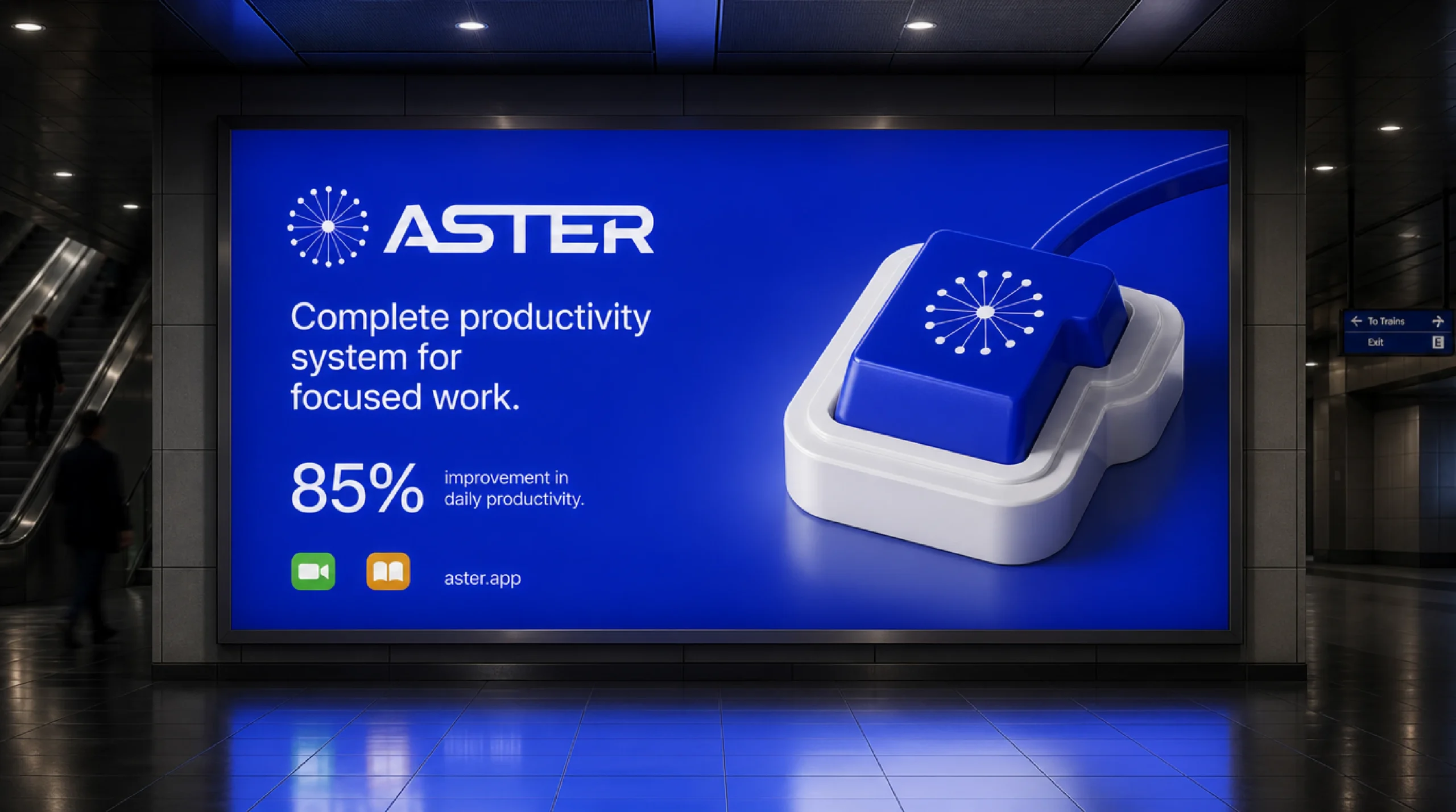
A subway billboard built around one claim and one number.
14
The system
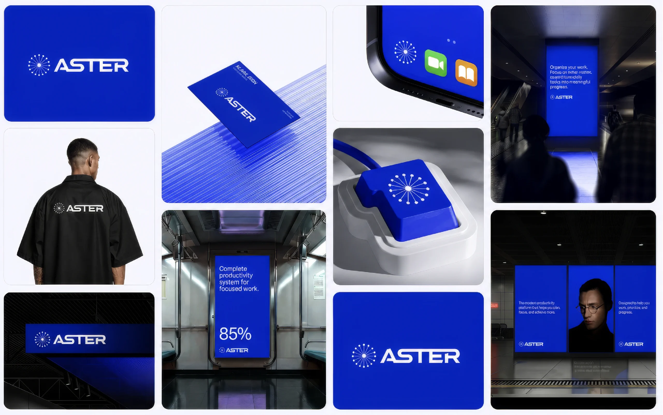
Everything together.
( The brief )
Small enough for an app icon.
Aster needed a mark that reads at app-icon size and still holds a wall. We drew a starburst of evenly spaced rays around one point, paired it with a wide geometric wordmark and built the whole system on a single electric blue with black and white, so every screen, print and product feels like the same brand.
Aster blue #0C20C8White #FFFFFFBlack #000000
( Next step )
Your brand could be next.
Tell us what you’re building and what isn’t working yet. We reply within one business day.


